This project was my capstone for graduate school, from inception, user research, design, development, and testing. This project embodied what I am passionate about, creating researched, accessible, usable websites that are inventive and aesthetically pleasing.
For this project, I wanted to find something that I found frustrating to do online, and knew could be done in a better way. Whenever I travel, I spend hours looking for a hotel to stay at, often becoming overwhelmed, giving up, and finding something last minute that when arriving at the hotel realizing that the hotel was not what I wanted. User research was included to ensure that I was not only catering to my needs, as well, user research also became an essential beginning step as proof of concept and a greater understanding of user needs..
By focusing on the amenities that users' want from a hotel, they can hown into what they want first. By creating a smaller pool of results, this cuts back on feelings of being overwhelmed. It is all about options, your options for hotels, and your options on how to book — allowing users to feel more comfortable with their choice ahead of their trip.
Two methods were used for user research, first an online survey to understand if others were frustrated with the online hotel finding processing and their searching habits. Then a user group of 3 user testers was used for user interviews and user testing later on.
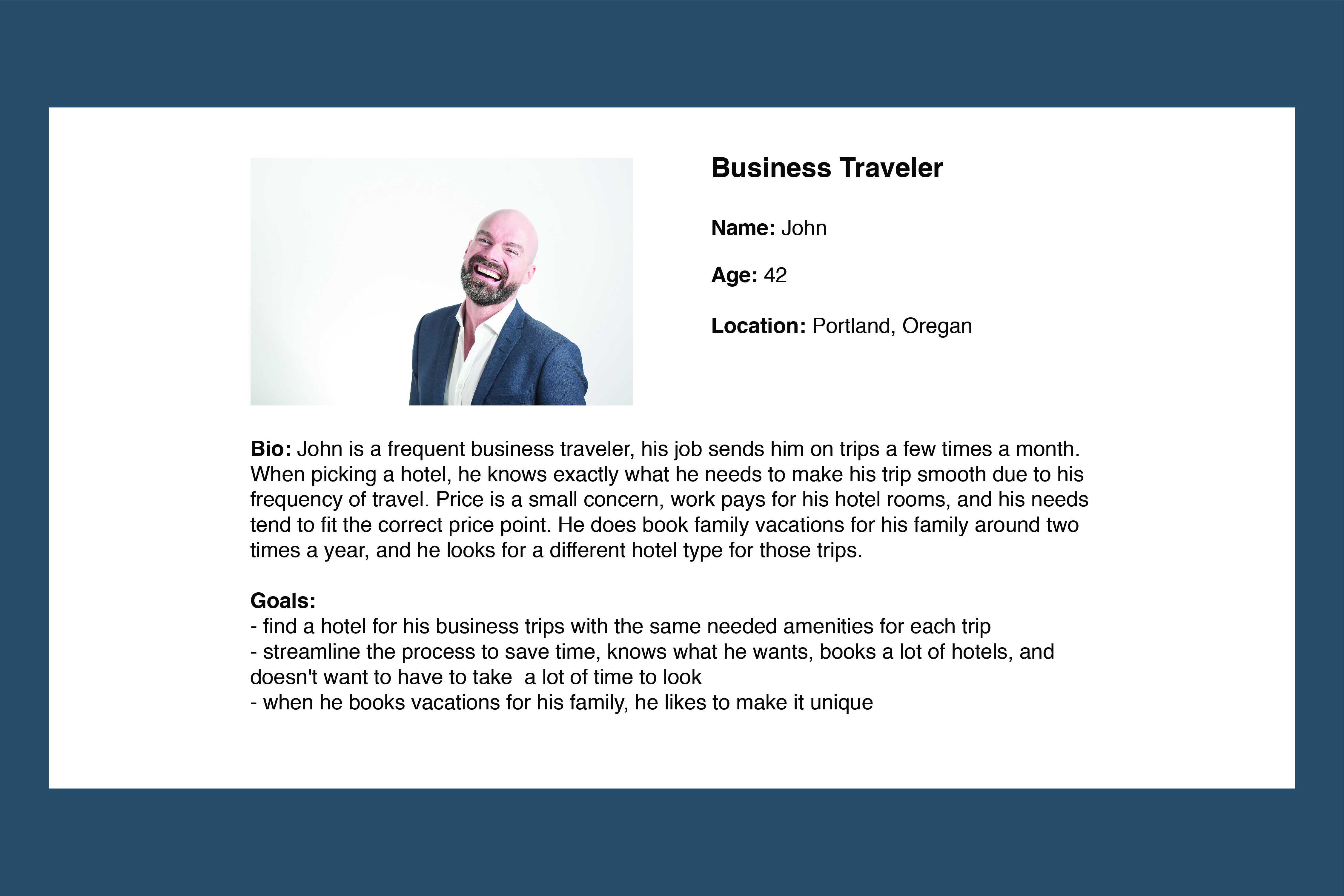
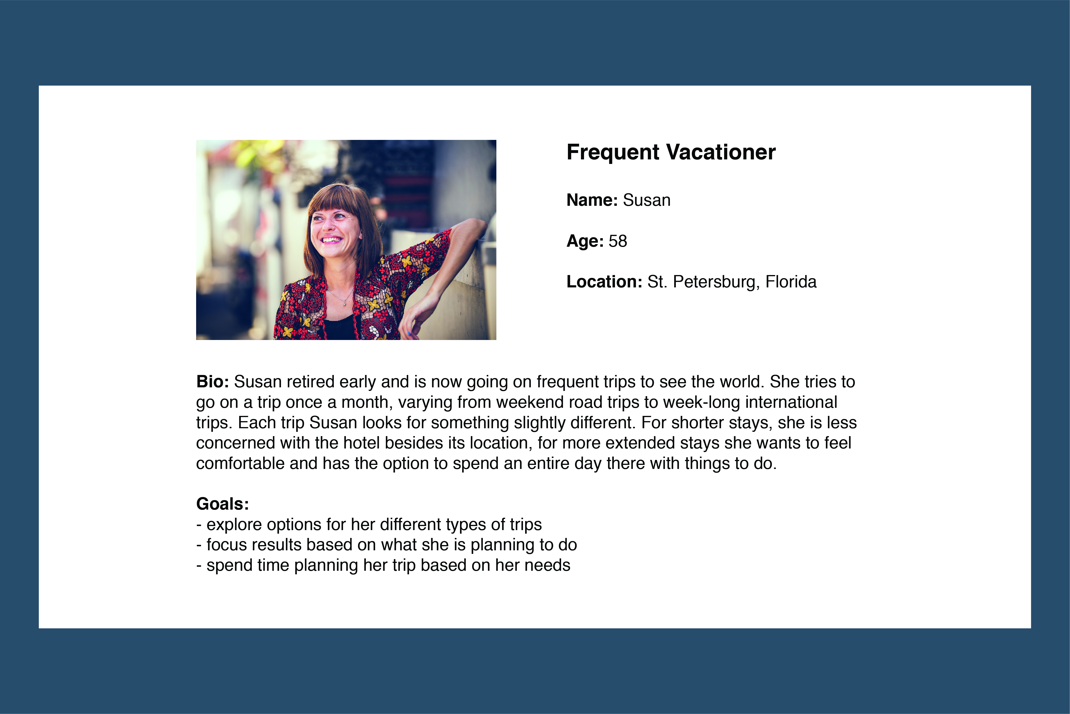
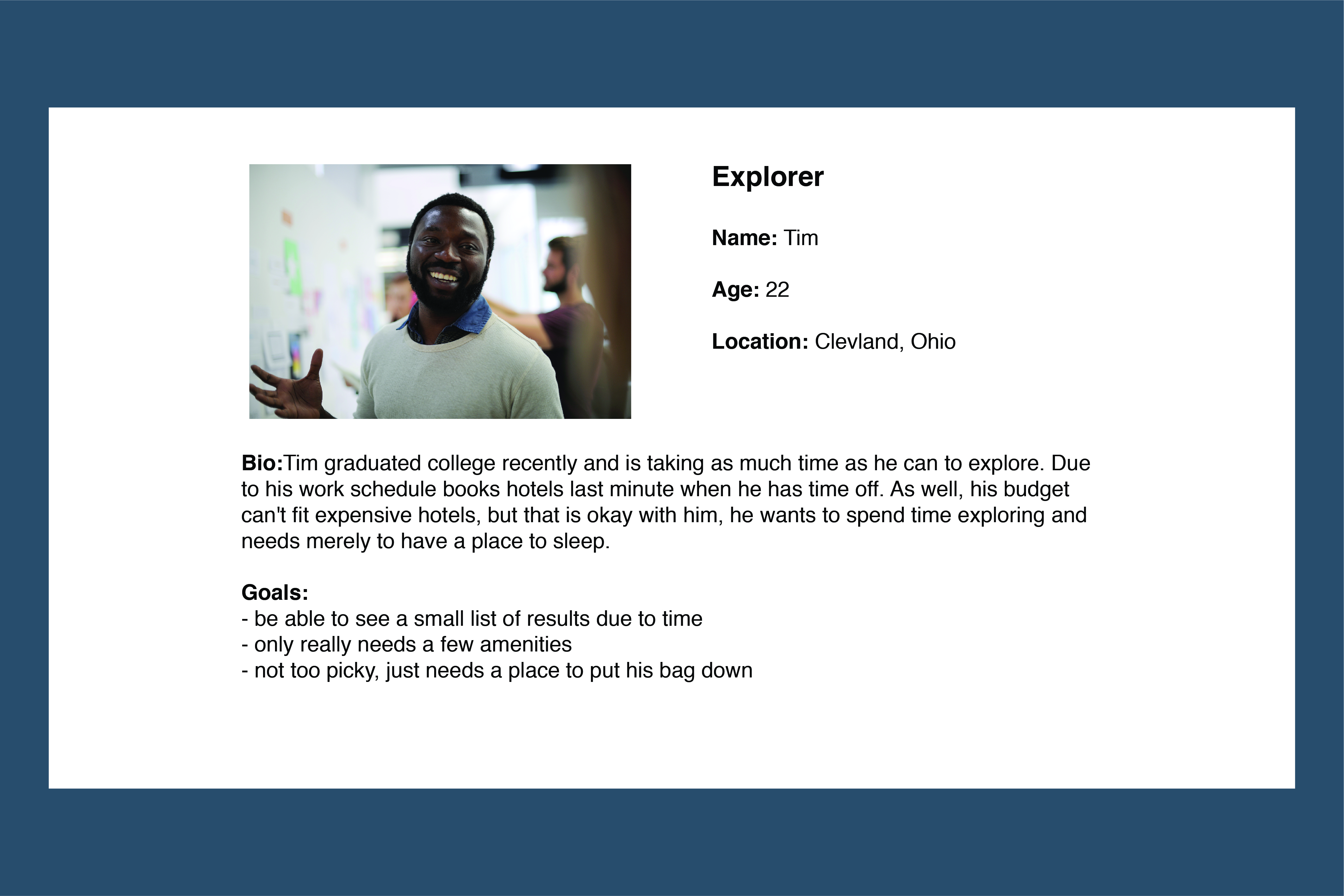
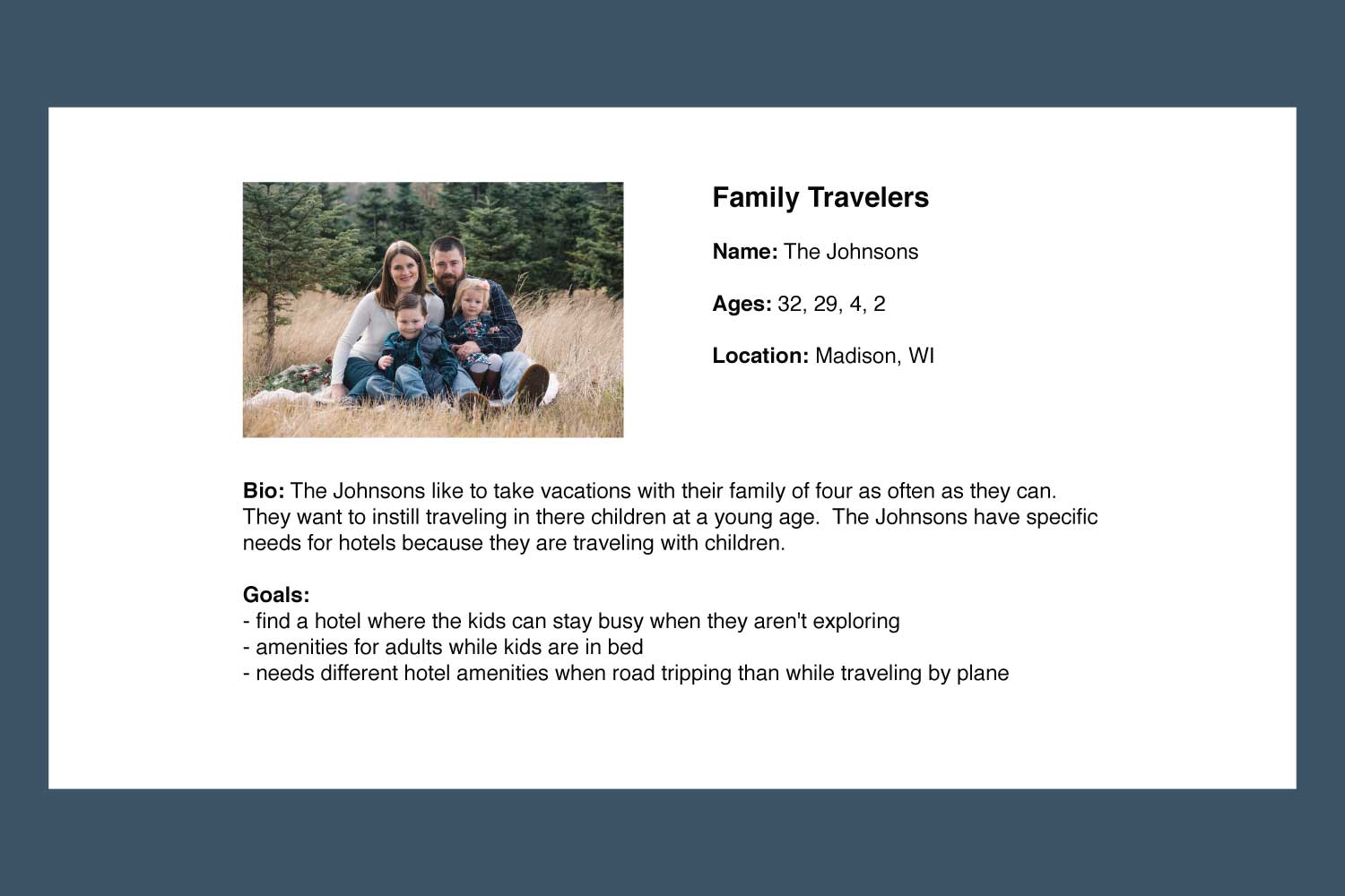
User Personas were created once the research was completed. Having user personas allowed for a point of reference for various types of users and their diverse hotel booking needs, preferences, and habits. Since this project was to help users find hotels in a better way, and not cater to hotels, no hotel or resort stakeholders were included.
User research came in two forms, a preliminary anonymous online survey to gather opinions, habits, and frustrations with online hotel searching. Second, a user group was identified that would have in-person interviews, and they too would be the user testing group.
The user research interviews conducted included three individuals with different travel habits from casual to a very frequent business traveler. Each interview included the same questions, but conversations leaned towards each person's habits. The interviews were one of the most pivotal points of understanding other people's travel and hotel booking habits. During the interviews, preliminary wireframes were shown to get some early opinions on the site before user testing of a developed product was conducted.
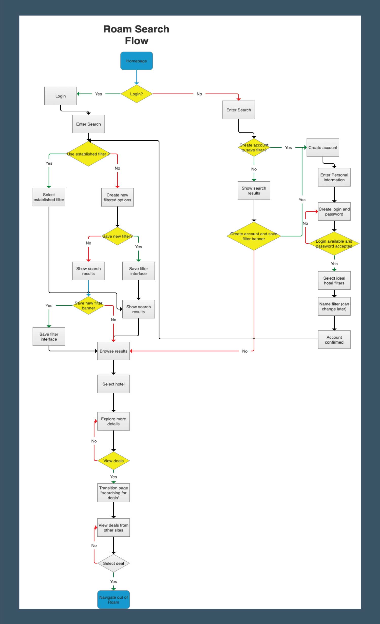
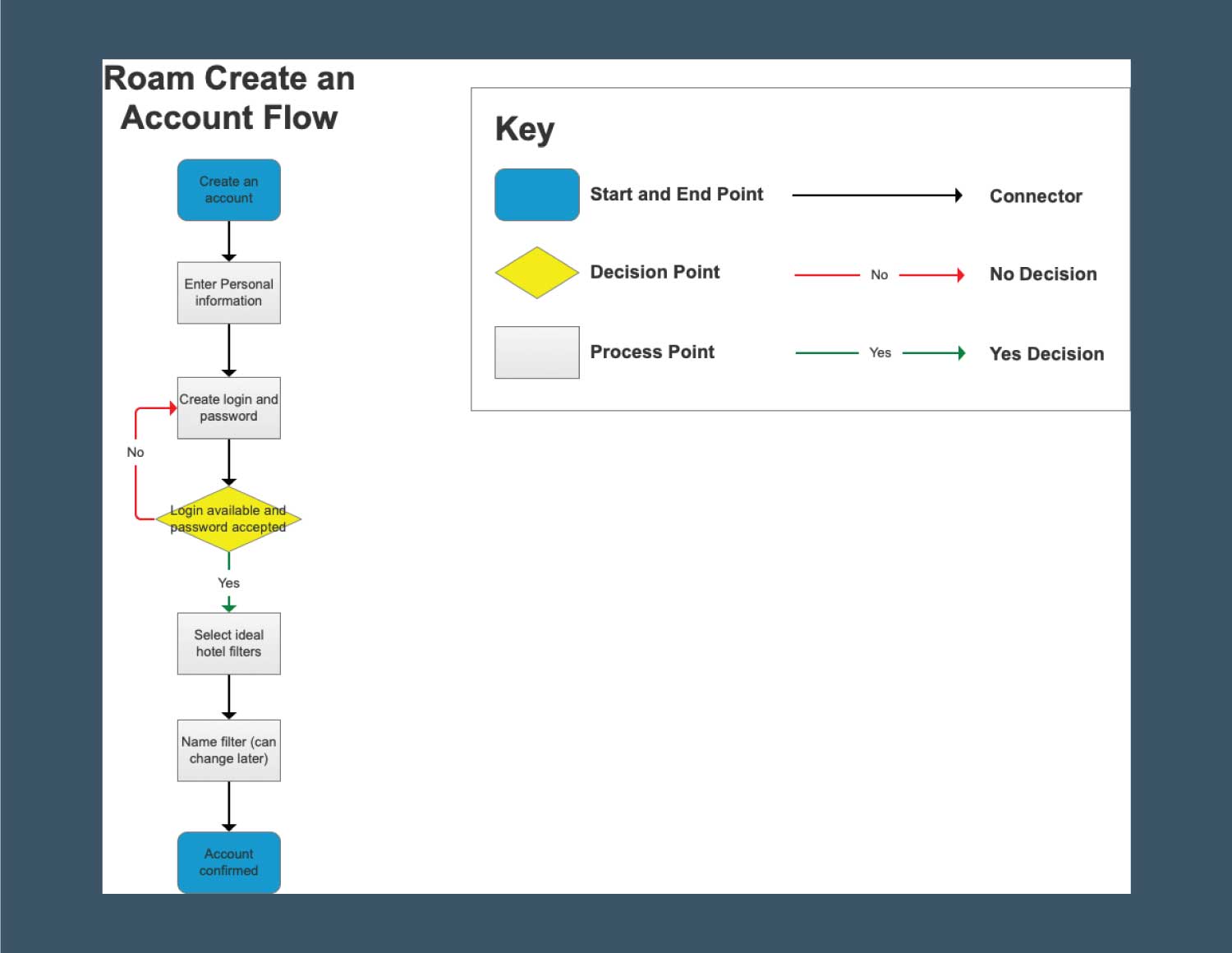
User flows for Roam were an exploration of how users' would work through the website in the hotel searching process. The two most substantial flows that were captured were the searching process and the account creation process.
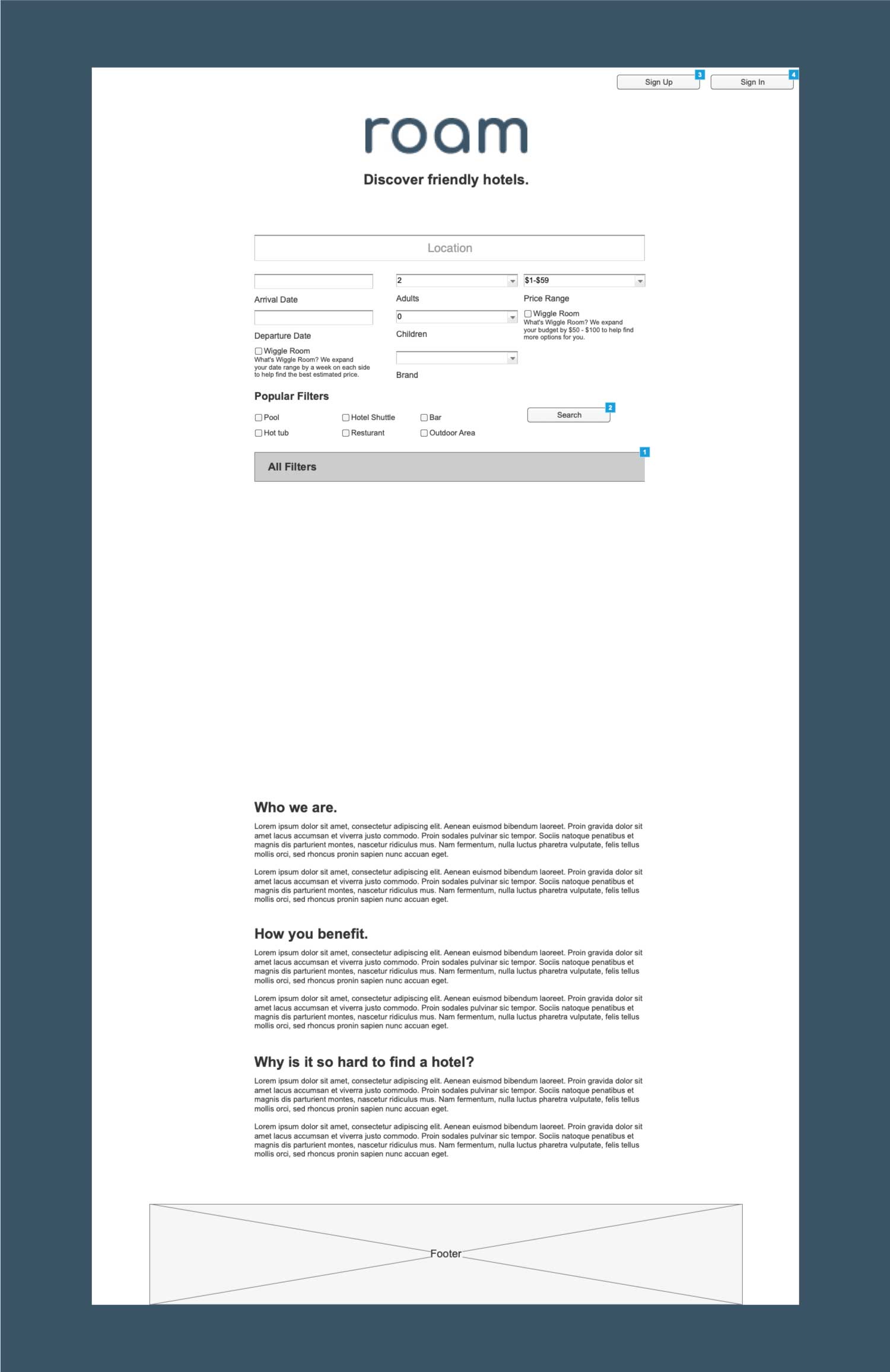
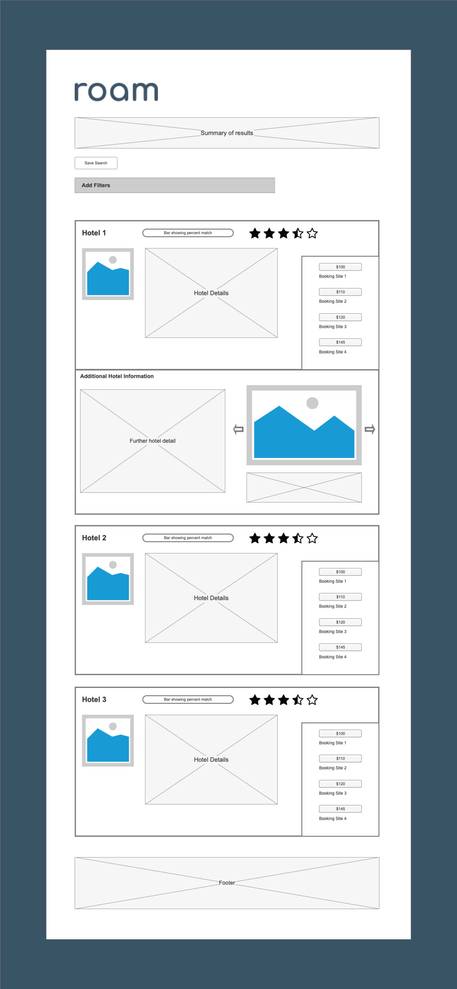
Wireframes were created with Axure, after an initial round of hand drawing wireframes. Using Axure allowed for the creation of a high fidelity prototype while also creating static wireframes. The high fidelity prototype allowed for exploration of how to manipulate the advanced filters that would be included in the search interface. The filters needed to be extensive due to the nature of Roam, but to keep the interface clean and modern, another goal of the site, it needed to be out of sight when not required. Axure allowed the collapsed filter menu to be explored before any code was written. Creating the high fidelity prototype also allowed for some initial feedback from the user testing group in the early phases.
The intent of the Roam logo was to be as simple and welcoming as the Roam website itself. This was achieved through the use of lower-case and a rounded sanserif font. No additional decoration was included so it could stay as simple as possible.
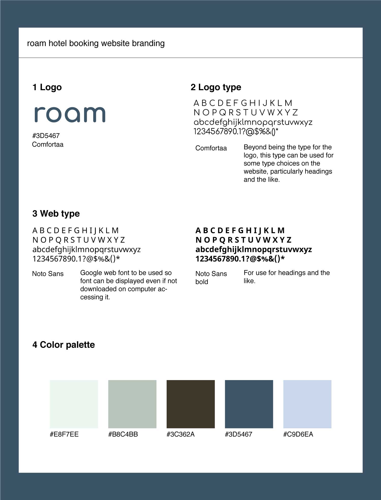
A style guide was created to be referenced during the design and development of the project. In a full-scale launch, this would have been the guide to produce advertisements and social media posts.
The style guide consists of the logo, it's color and font as well as the font for the website and color palette. The font choice for the website was chosen similarly as the logo, simple, easy to read, and welcoming. The color palette was to be calming and reminiscent of a relaxing vacation, be it near the water, nature, in the middle of a city.
User testing was conducted after the first round of development. The group of three users was asked to complete a search and booking and create an account, as well as a few other tasks. While the user was completing the task, observations were done making notes of when the user may have had difficulty or moments of frustration. As well as any other potential changes that came up while observing someone interacting with Roam. After observations, several interview questions about the users' experience was conducted to understand further changes that needed to be done.
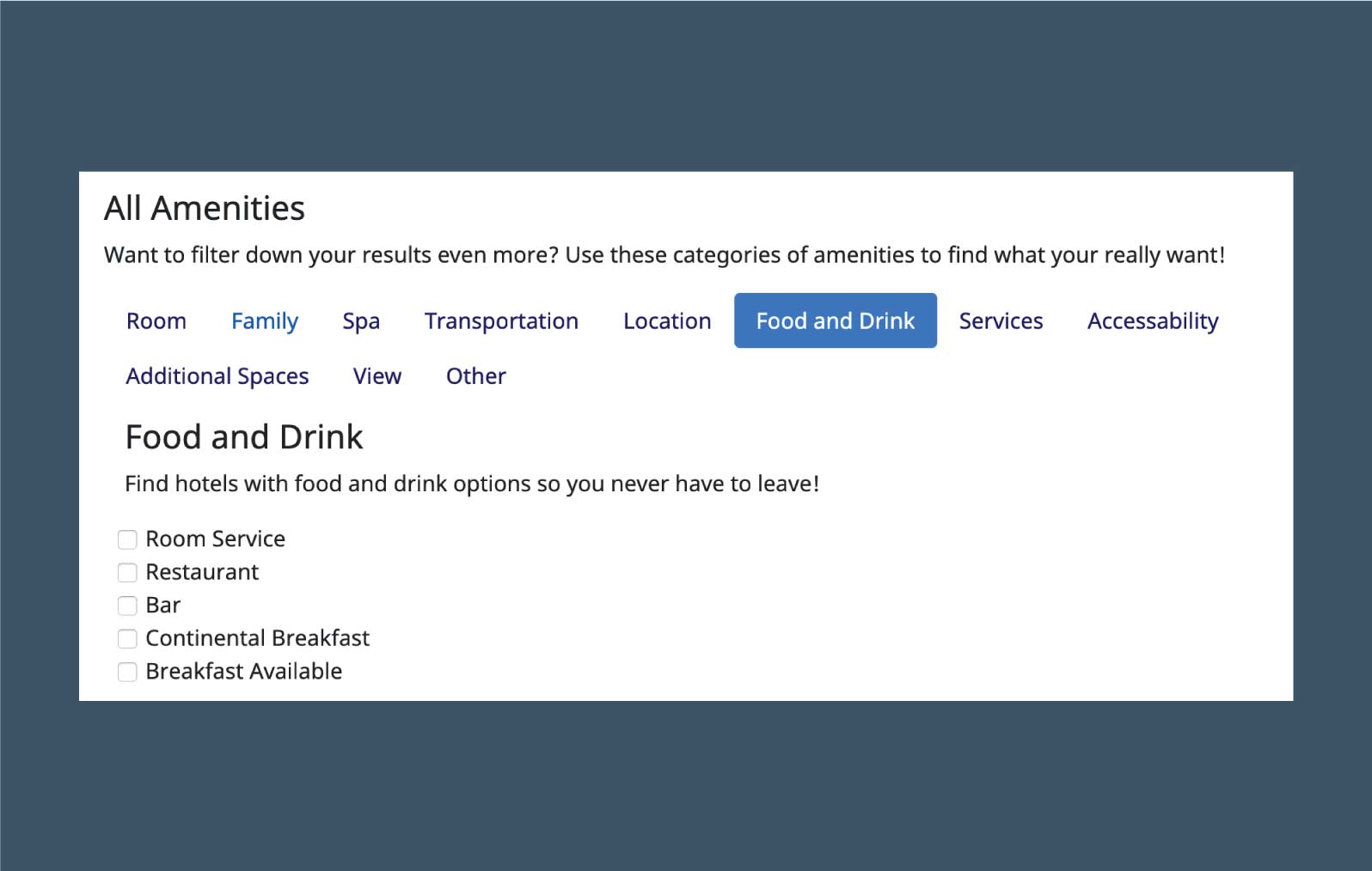
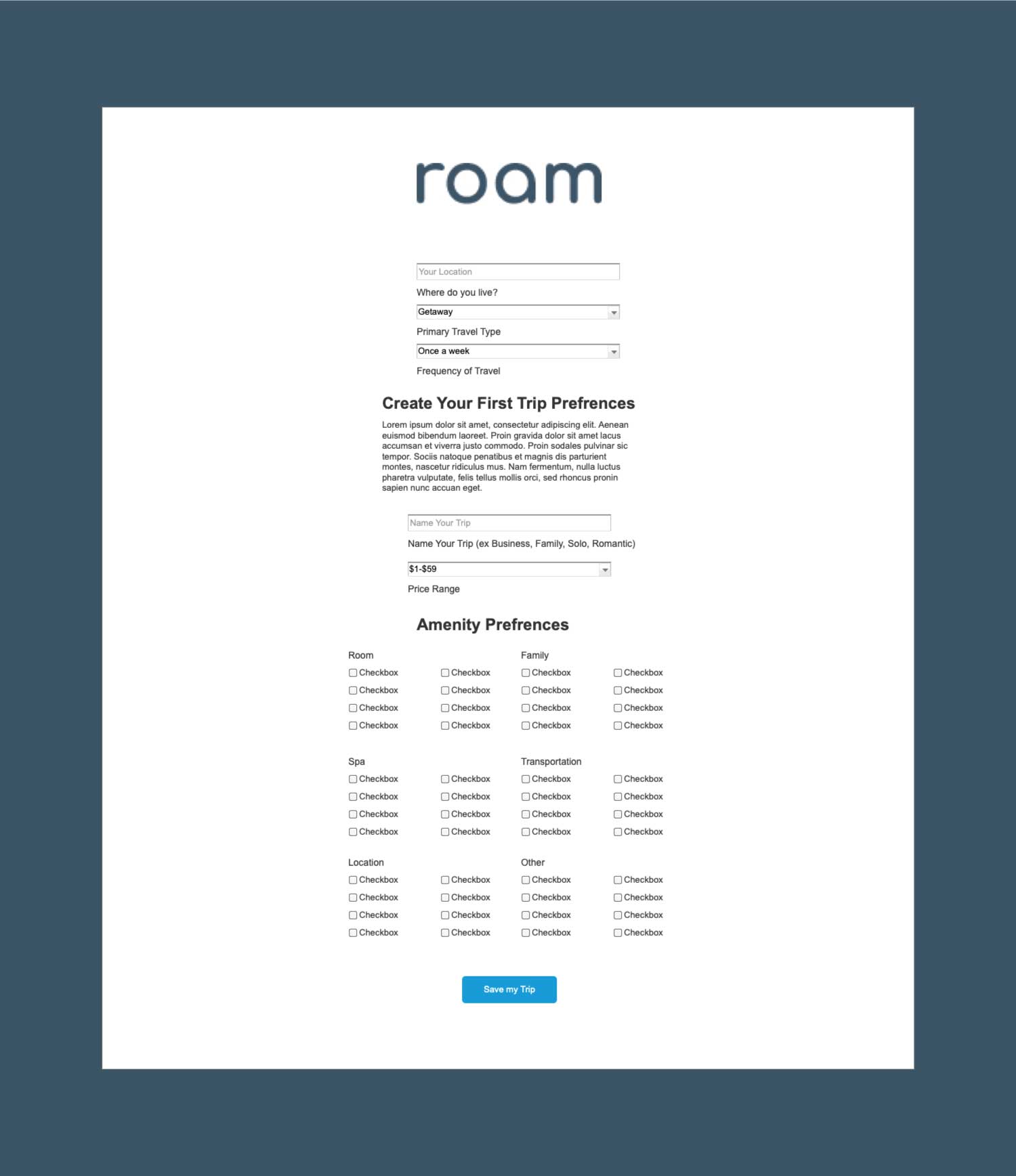
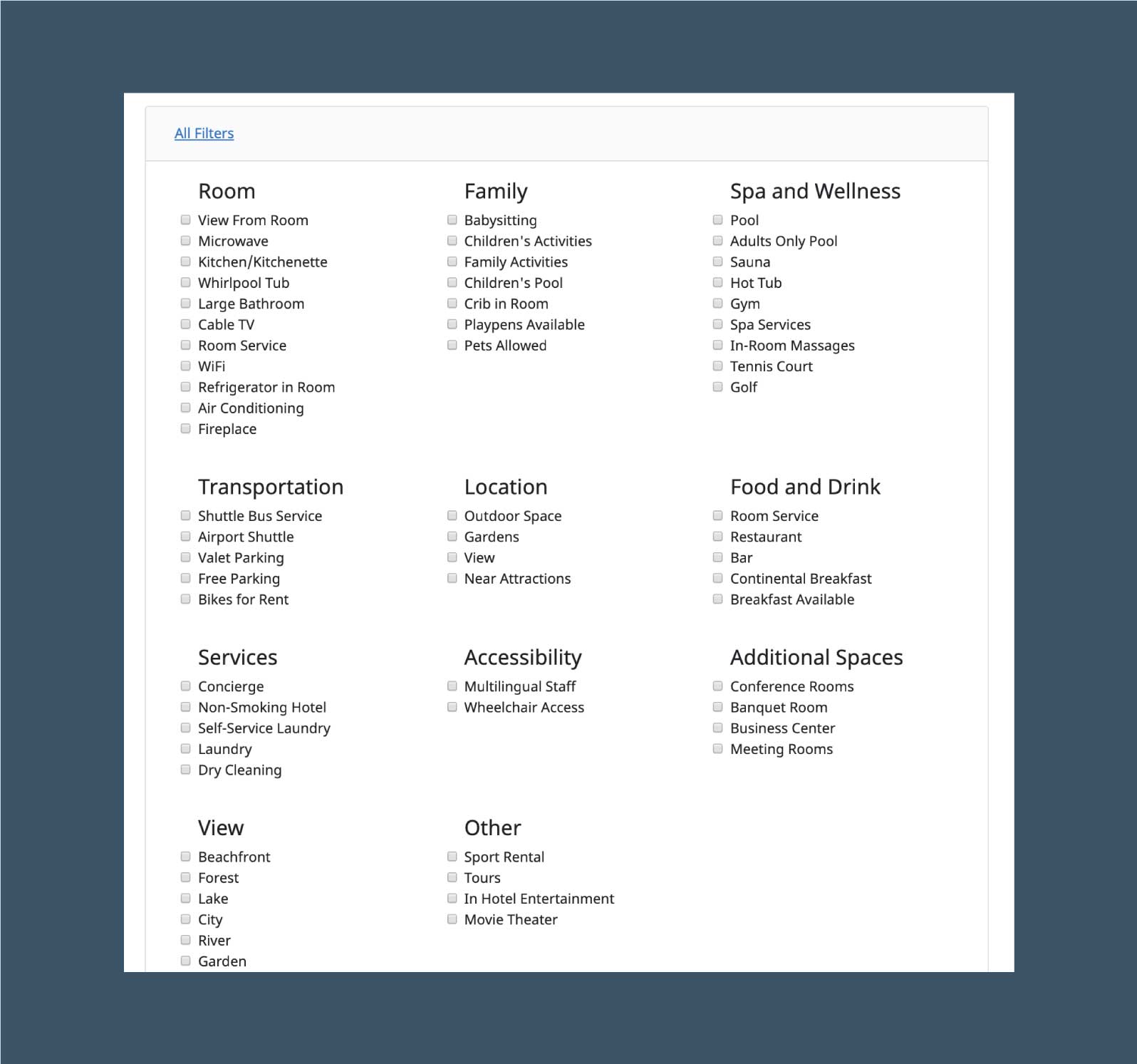
With Roam's differences in how people find hotels, focusing on a long list of amenities. The first version of Roam had an extensive list of amenities with headers of categories, each amenity with a checkbox, all viewable at once. While conducting user testing, it became clear that this was overwhelming. Being as that Roam's intention is to make the hotel search process less overwhelming, this defeated that purpose. A new structure needed to be created that was cleaner and more structured. The new filter structure had a collapsed section format, wherein each category has a button and those amenities open, which can be repeated for all categories. This allows for all the amenities to be easily viewed based on categories and users' never have to view categories that do not pertain to them, such as "Family."
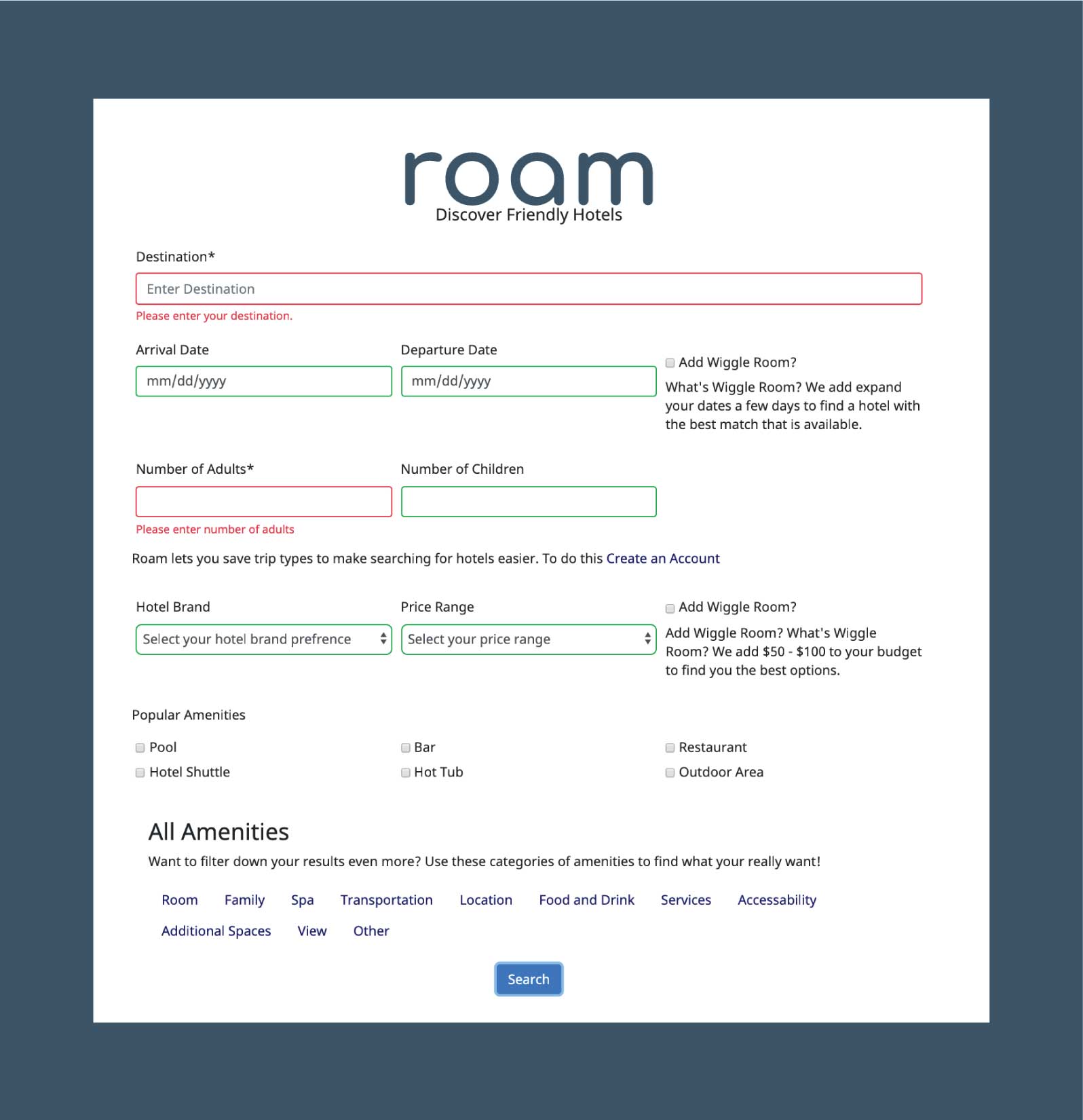
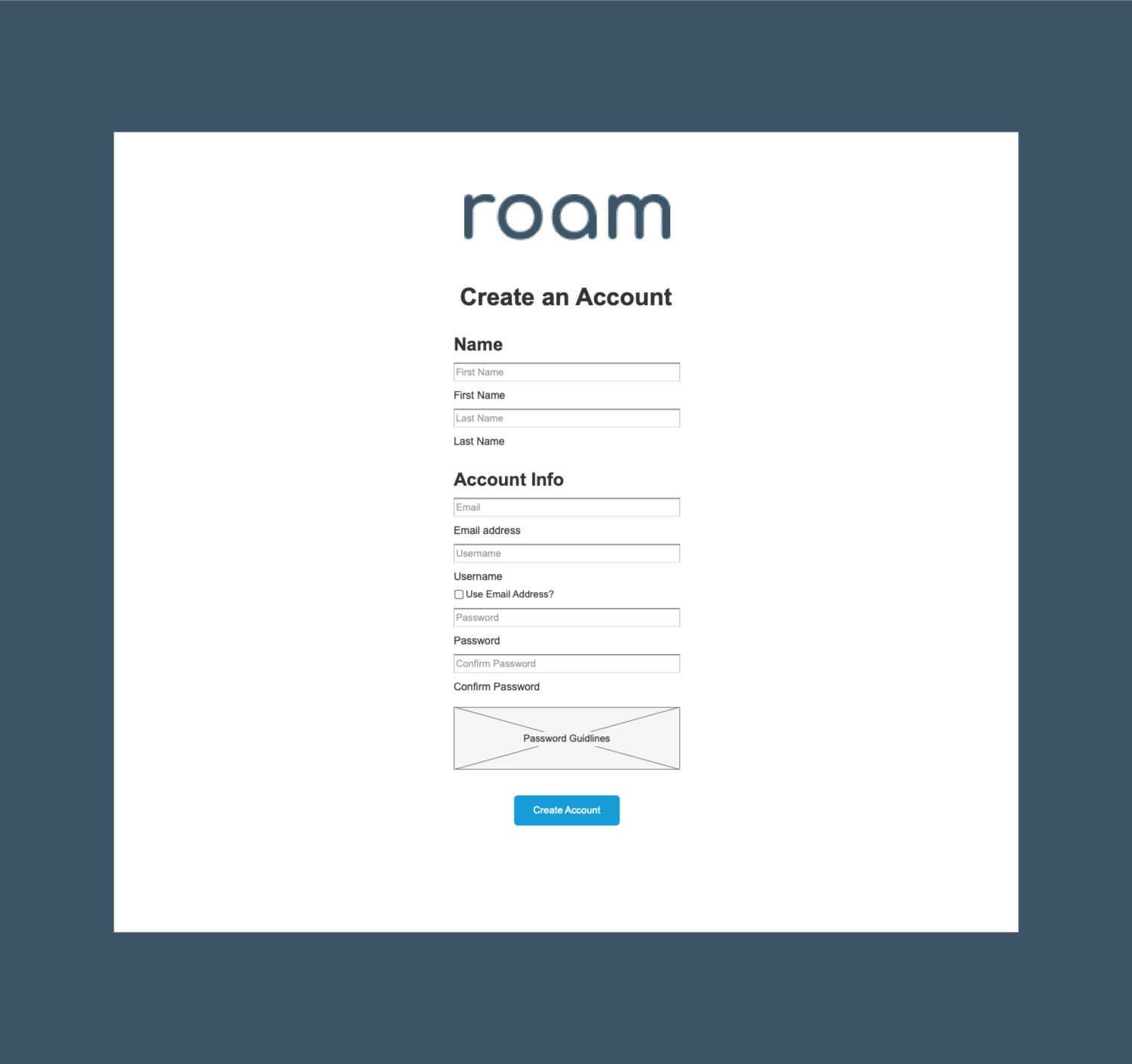
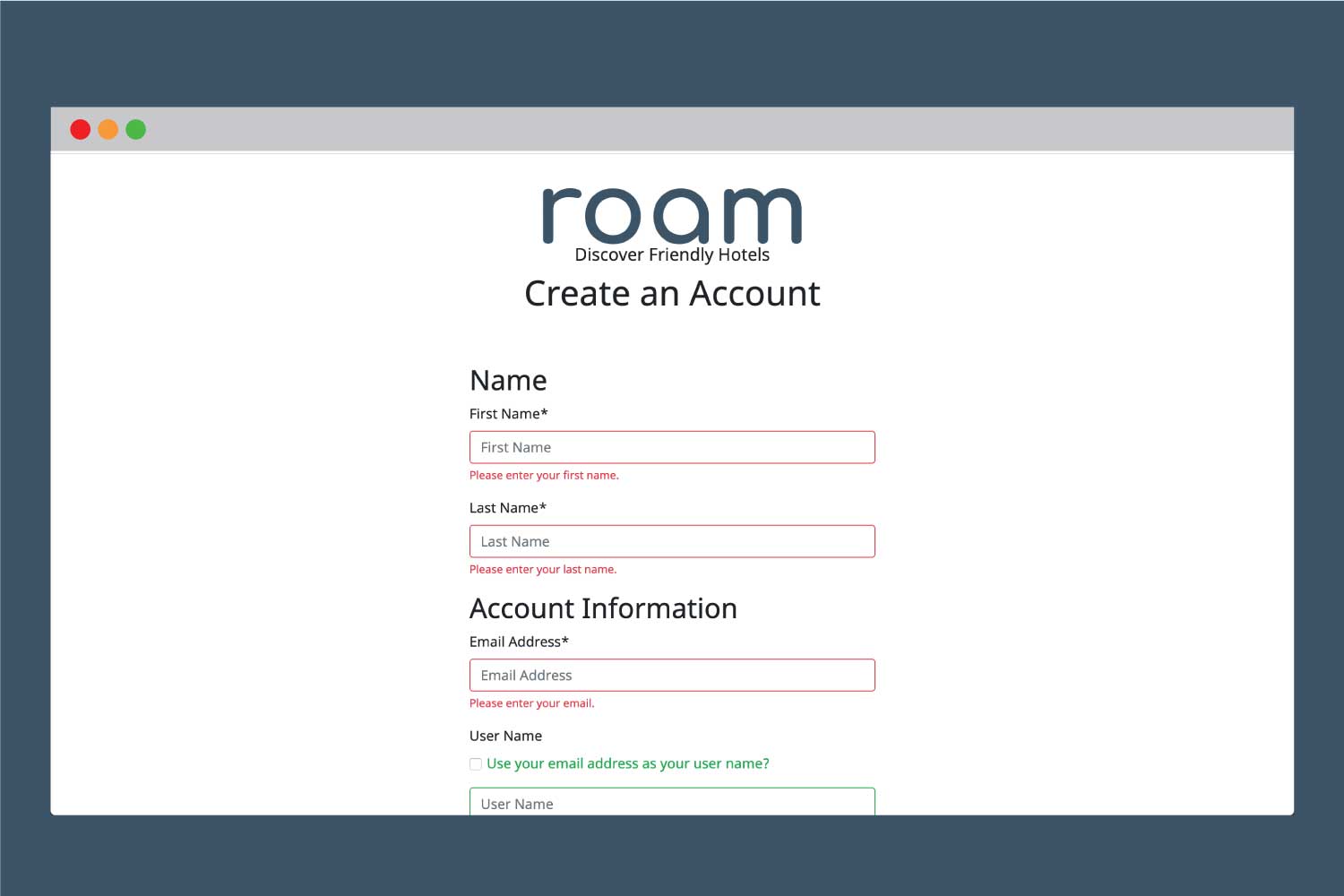
While conducting user testing, it was clear that form validation was needed as users wondered what fields were required. The first version had an asterisk next to required fields but this wasn't enough for users to know they were required and led to confusion when the form didn't submit. Including the red and green validation in the second version, this helped clarify this issue. Form validation was also included in the user account creation process.
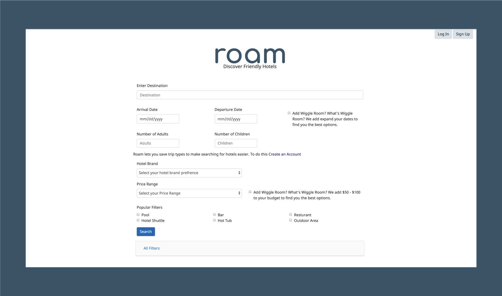
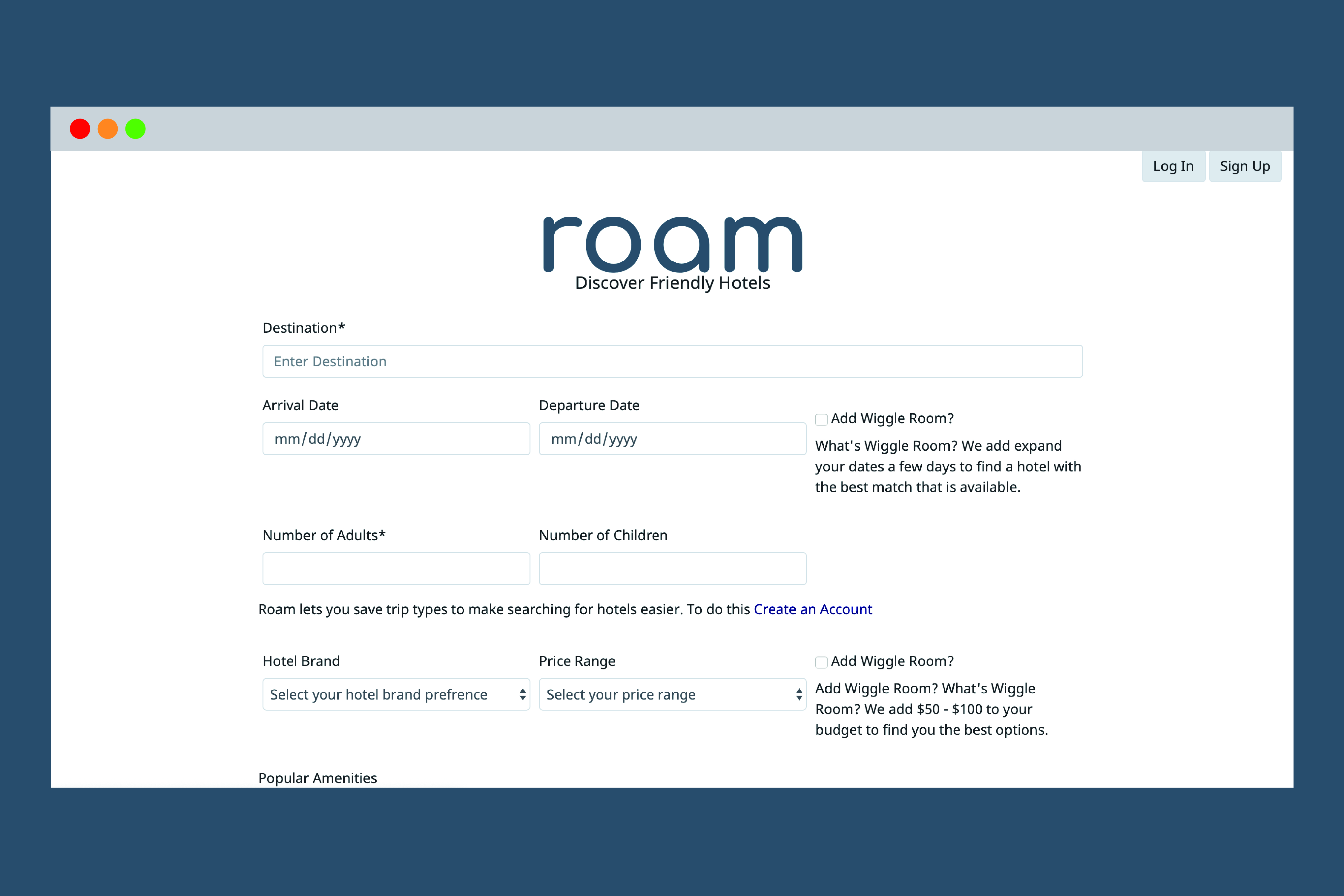
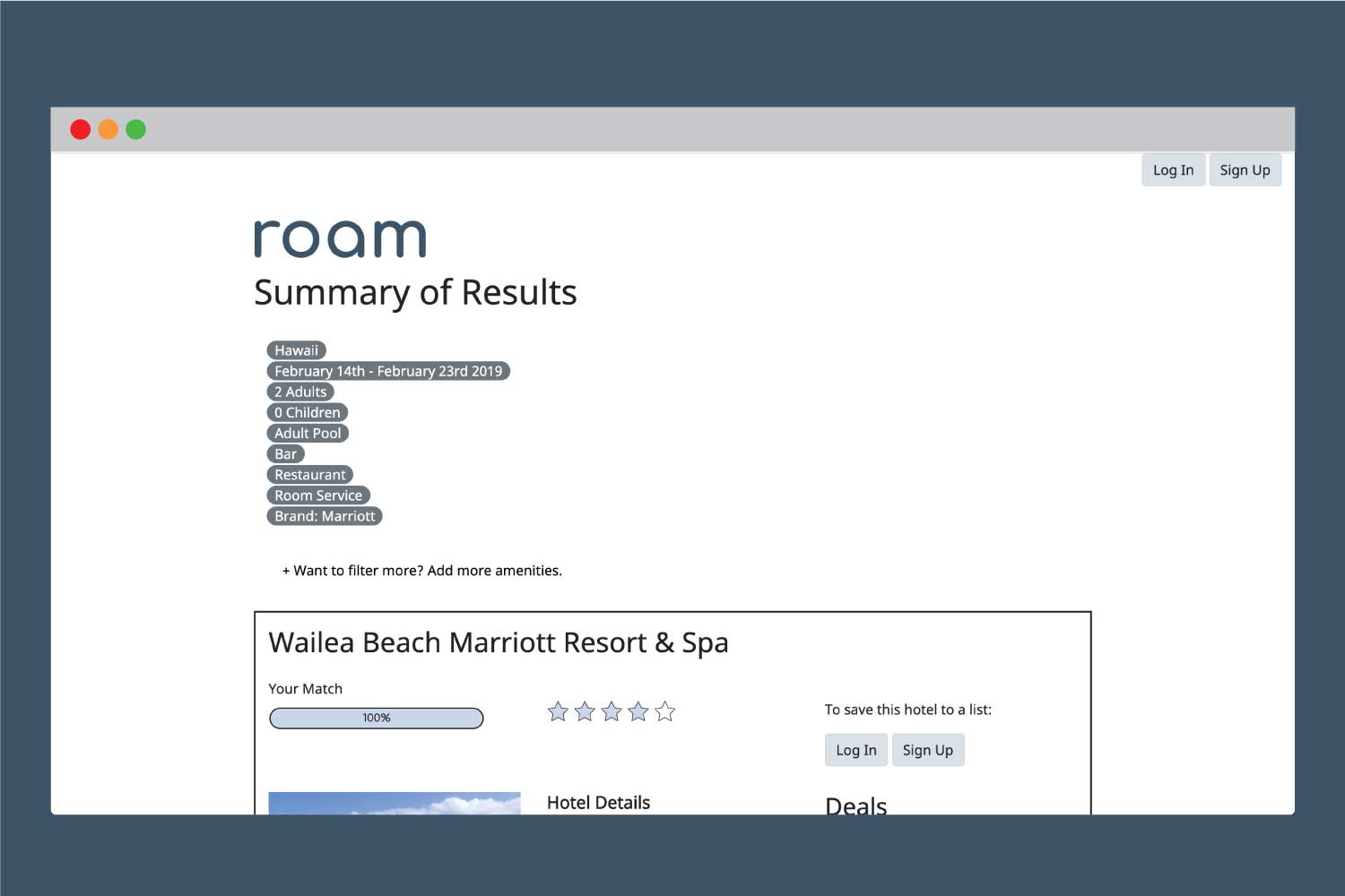
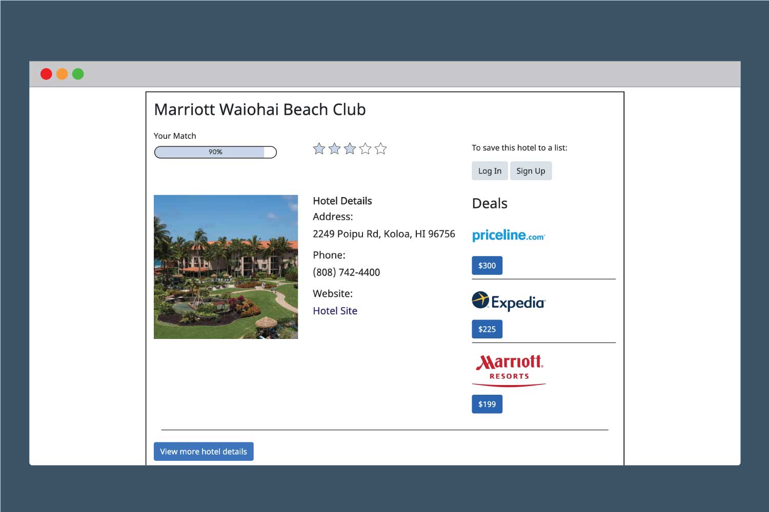
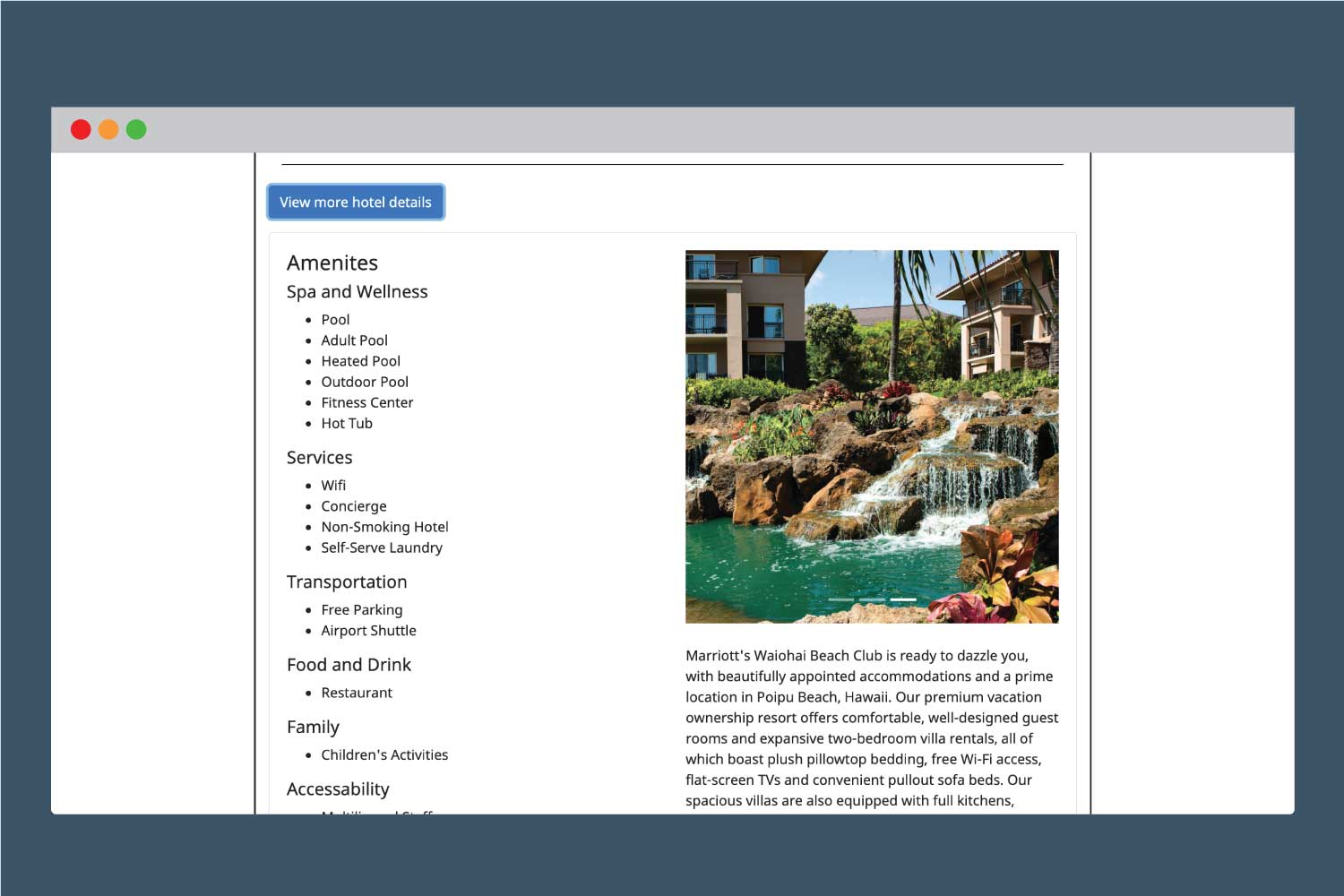
These are the primary interfaces for Roam, the homepage, search results, and account creation from the final version of Roam.
Roam can be viewed in full here.
Roam was built with Bootstrap to be mobile friendly. The data set used to create the prototype was created with a data set of Hawaiian resorts. These were put in a MySQL database, and the search parameters that are included on the search result page are what were used to pull the results that are shown.