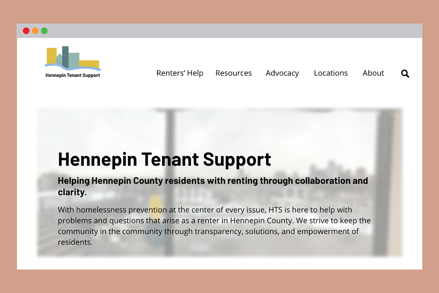
The Virtual Tenant Resource Center is a proof of concept prototype website designed in coordination with the Tenant Resource Center, an innovative in-person resource for homeless prevention where providers are collocated to help residents find help. Created in coordination with the Minnesota Design Center, Hennepin County, and community coordination providers, the VRTC sets out to innovate online human services. Ultimately, creating a user-centered, interactive resource for residents to get transparency in services available to them and empower them with greater understanding.
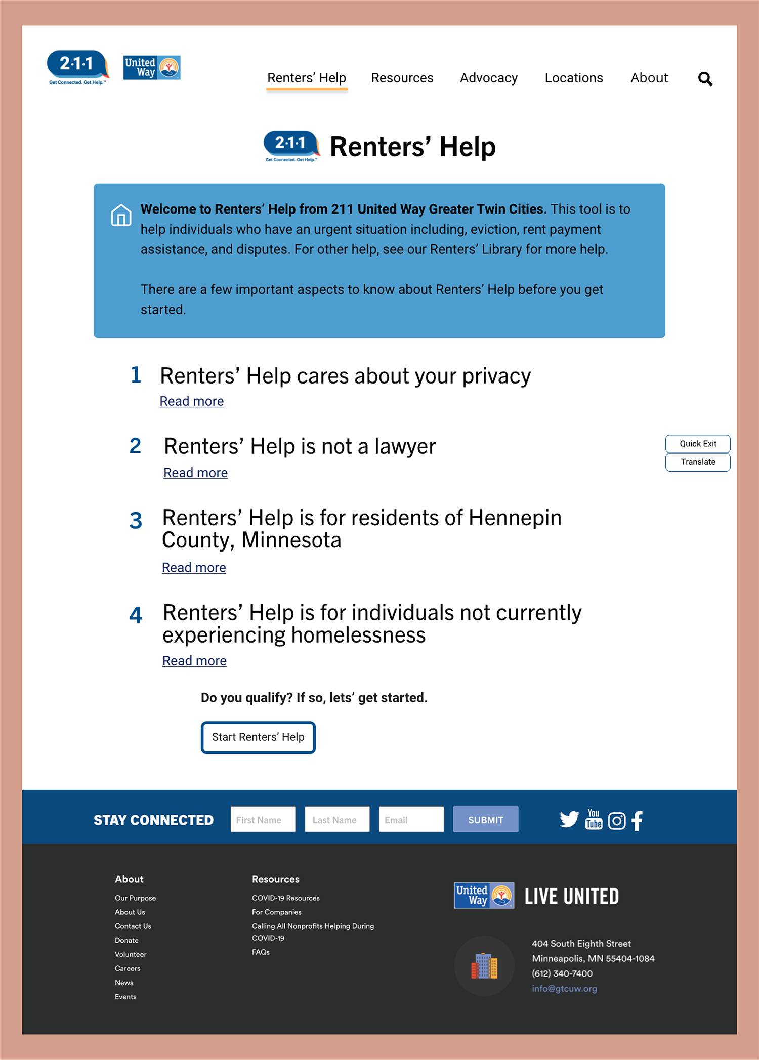
Typically, human resource websites are not very human-centered. They are providing lists of resources or information with little explanation. The VTRC site has a section called "Renters' Help," which is an interactive guided navigation through various homeless prevention resources. Users can navigate through Renters' Help by answering questions and getting customized help based on their situation and needs.
The initial research phase for this project involved reviewing several reports on evictions in Hennepin County and Minneapolis, particularly in North Minneapolis, where evictions occur at a disproportionate rate.
The research that has been done exposed issues within the current system that influenced this design, including that ultimately many residents wanted a virtual way to access help.
First, there is an overall feeling of uncertainty towards Hennepin County as a provider among residents. Although Hennepin County is actively working on redesigning prevention services, it was essential to consider that information. This is manifested through the prototype being designed as an independent entity. Though Hennepin County could ultimately be the owner or a stakeholder for this project, the user-centered approach, and innovation in design would fit into their redesign process.
Second, residents felt that the way they are being interacted with while getting help could be friendlier and more transparent. This manifested itself in much of the way the Renters' Help section communicates information to the user.
Third, residents often return to the systemic issues that drive the immense need for homeless prevention services, which influenced including an advocacy section of the site. This issue also impacted the general push for empowering residents with information on the homeless prevention system.
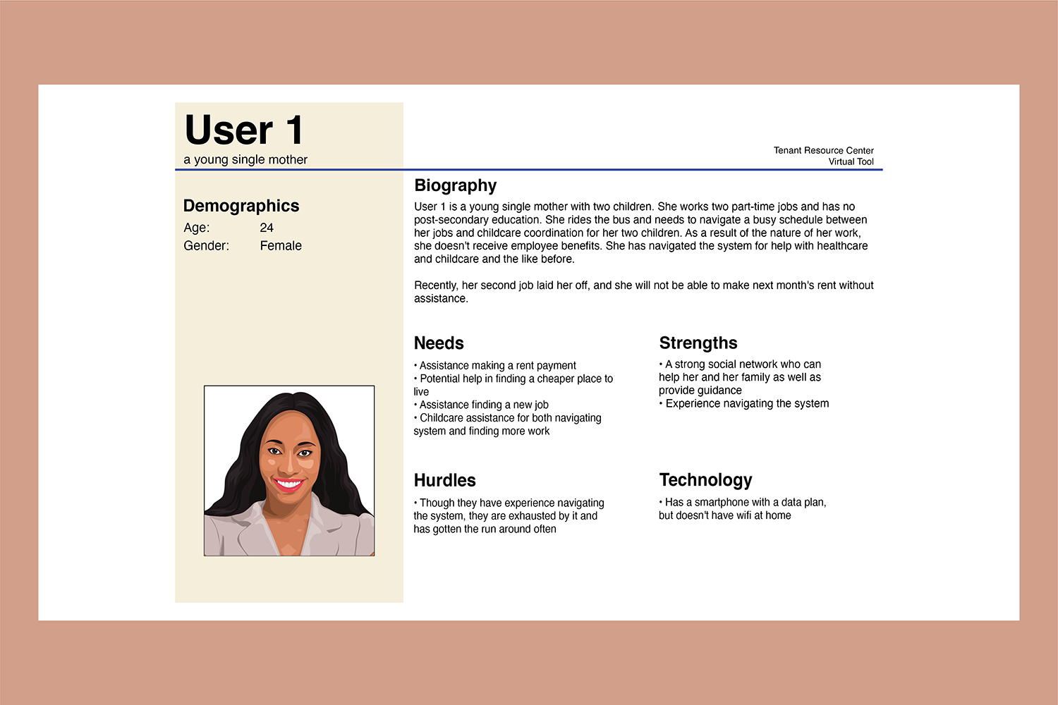
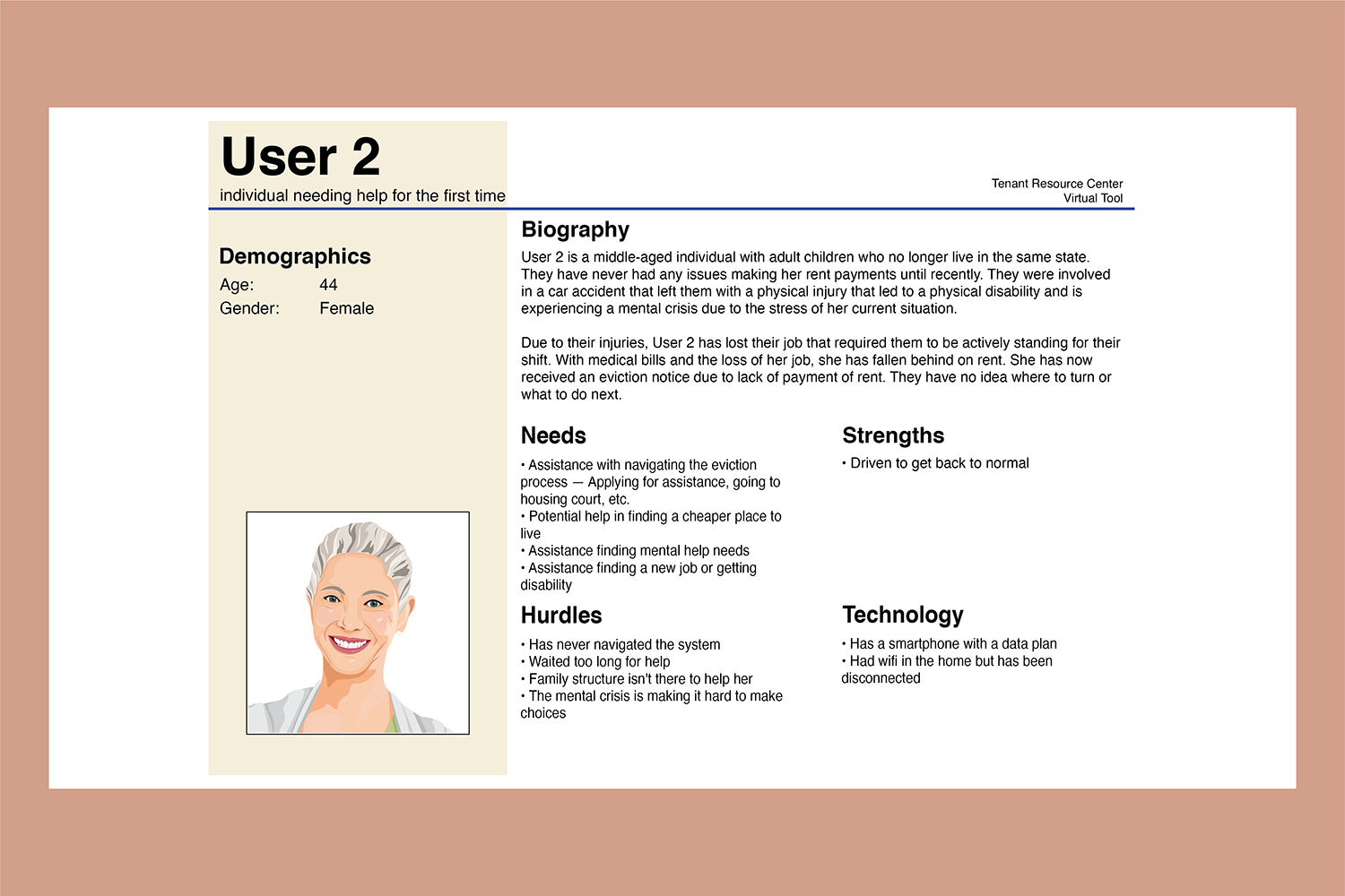
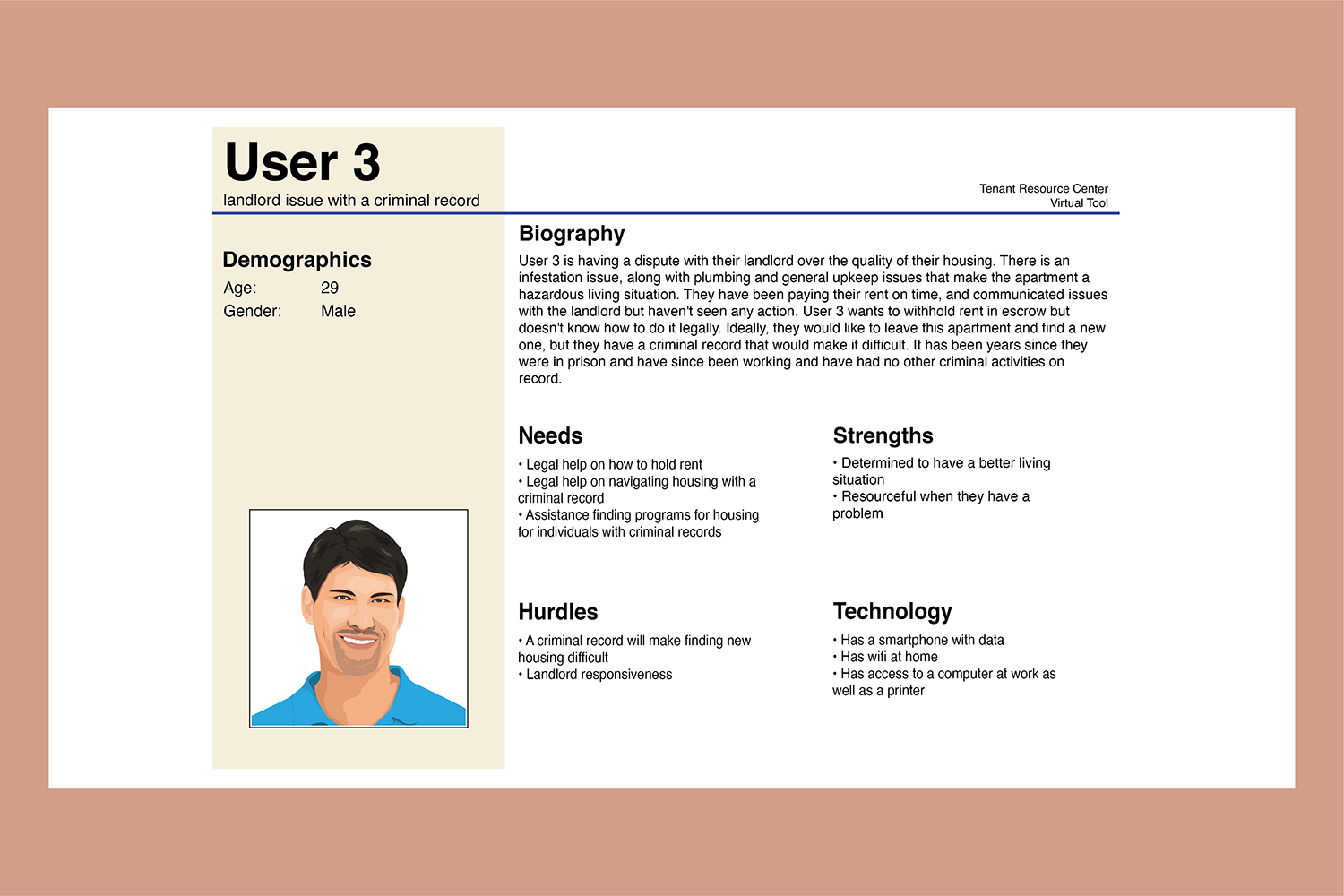
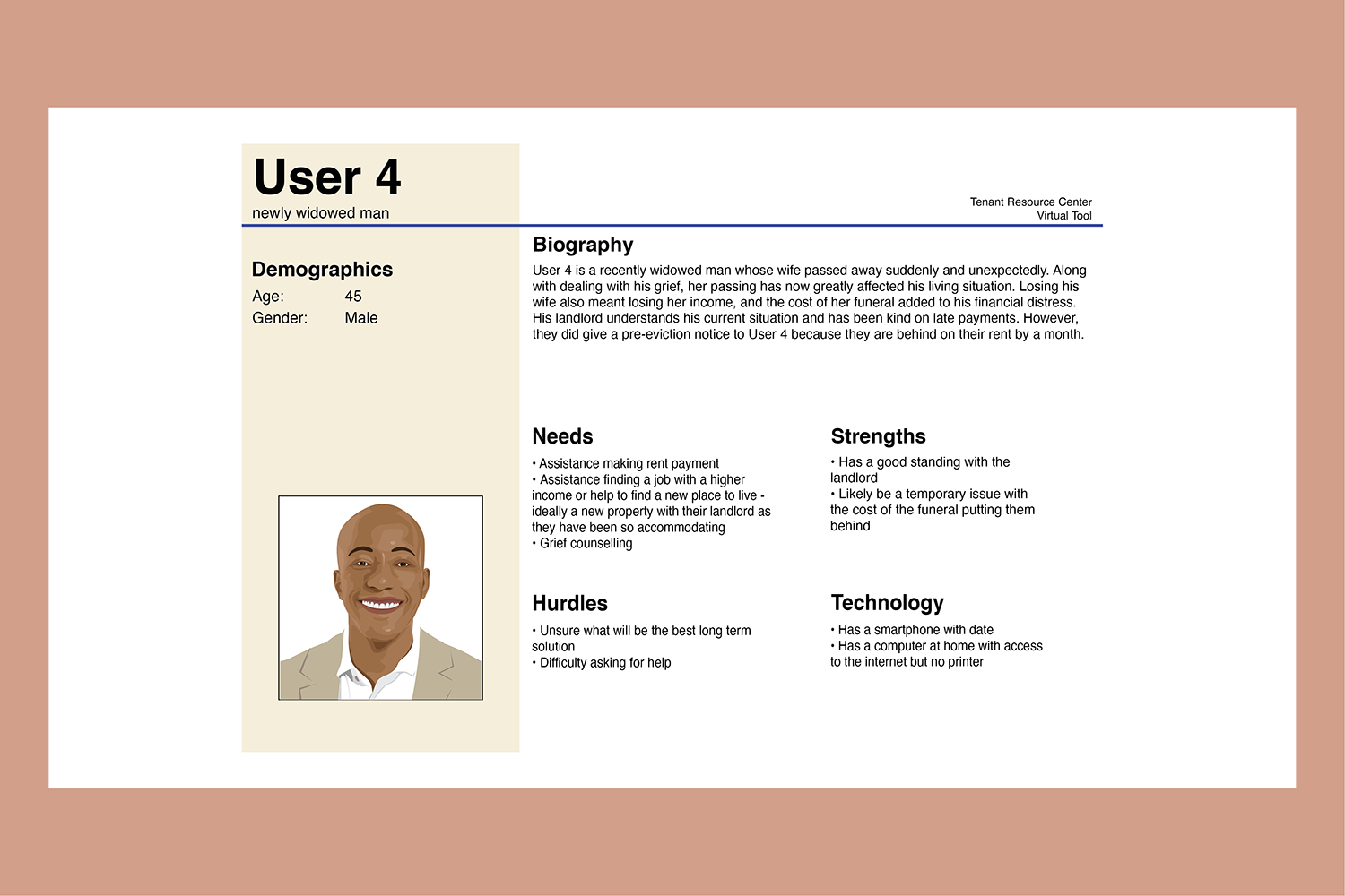
By looking at the research pieces detailed above and what the community providers had described, user personas were created. The user personas developed for this project embody the complexities and multifaceted situations that residents experience when in need of homeless prevention.
To see all ten user personas, see the final report.
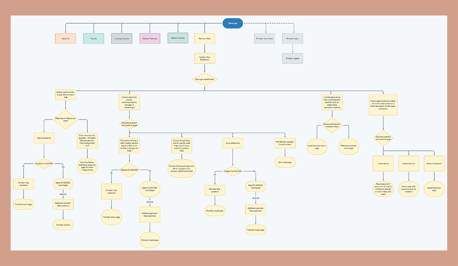
To first understand what the Renters’ Help section needed to look like, user flow development was completed with guidance from community providers, who helped visualize the different paths a user could take to get help in person. The most substantial design choice that came from this work was the three categories of support. These categories are preventative help before landlord action, the landlord has taken action, and dispute help (maintenance and other). The user flow changed overtime during the design process, but the overall categorization of support remained.
Initially, this project was intended to include several rounds of intense feedback sessions, both from providers and residents. Initial feedback sessions with groups of providers often left with little constructive feedback, small group/individual sessions were planned.
The COVID-19 pandemic changed the process for the end of the project. A week of in-person small group feedback sessions with designers and community providers was planned, to be followed by in-person user testing—that portion of the project aligned with the stay at home order. Virtual meetings were scheduled than turned to pre-recorded sessions. These received minimal participation.
User testing was moved to virtual zoom meetings where the participant would share their screen and be observed while accessing the site. With community provider help, users were identified. Still, ultimately no sessions were completed due to a combination of potential users dropping off once the consent form was sent or technology issues. It as recommended that the final owner of this website conducts rounds of user testing.
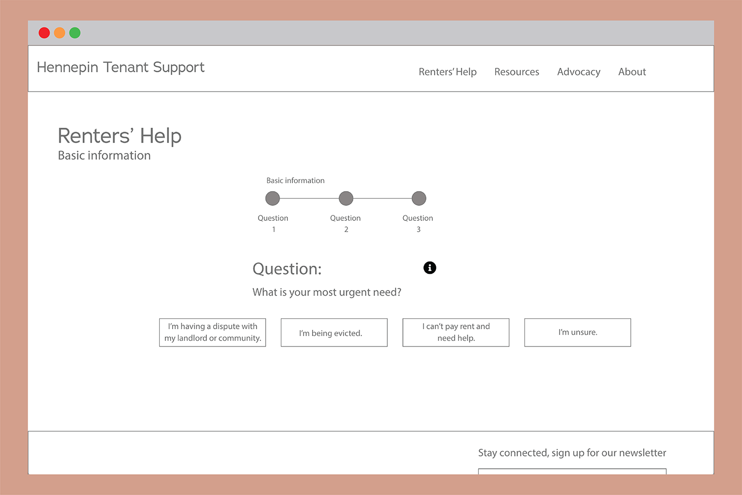
An initial wireframe was made to explore what Renters’ Help could look like. Several elements that were initially included in the first wireframes remained, such as the progress bar.
Renters' Help is the solution this project produced for helping users navigate a complex network of help that is available to them in the homeless prevention network of government, community, and legal advice.
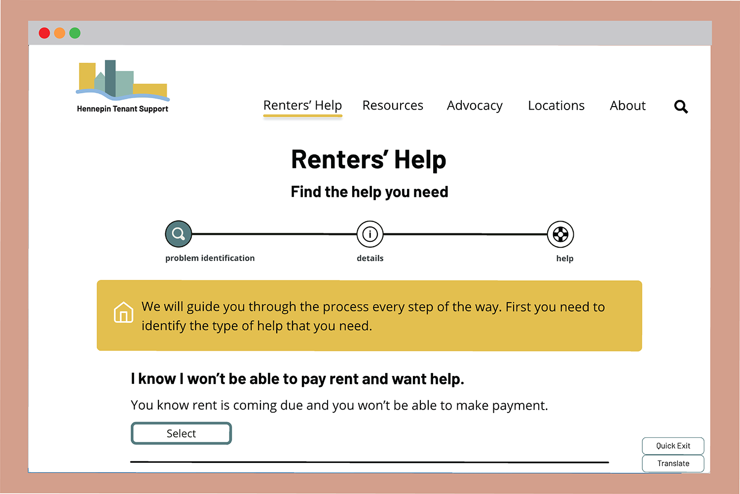
Renters’ Help is the bulk of this product. It was designed to be informative, earnest, but done in a conversational way to make the user feel comfortable. These choices are based on the initial research of what users wanted to see in human services. The section is structured as question-and-answer-based navigation that ultimately leads to a detailed result page with steps they need to take, or organizations they can contact for help.
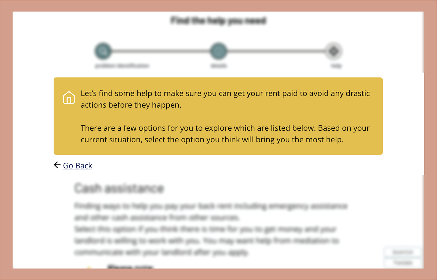
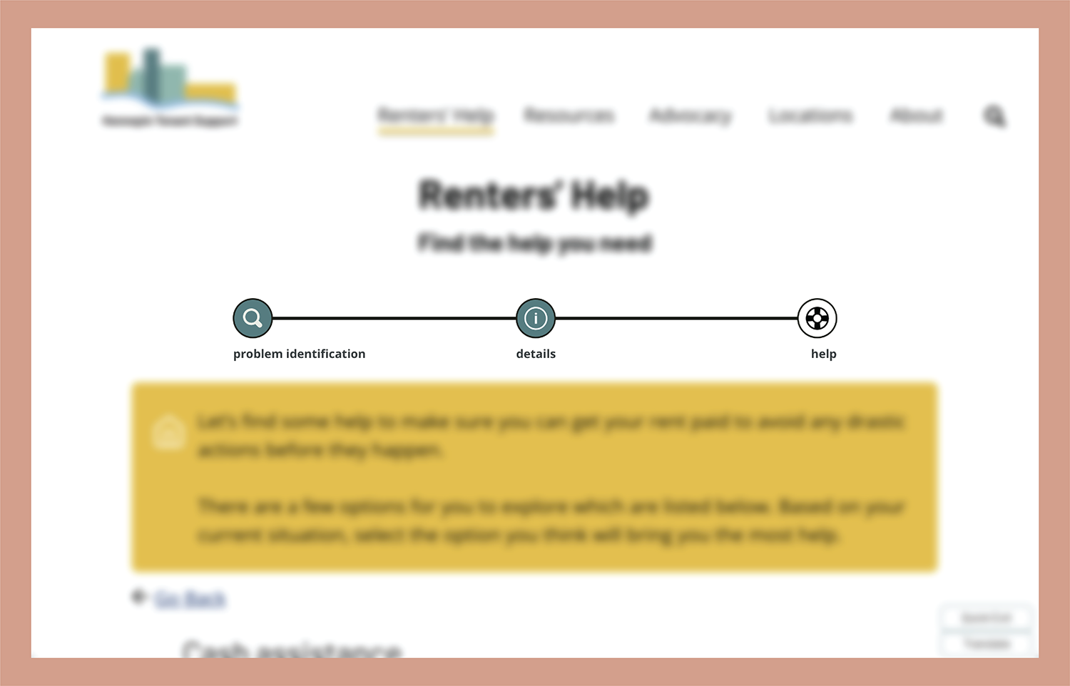
A feature on each page is the yellow box, called the Renters’ Help Speech Bubble. This feature helps keep Renters’ Help feeling conversational. The element acts as a way to review how the user got to the page where they are, explains what is coming next, and includes any information that may be critical for the user to know.
All Renters' Help pages will have a progress bar to help indicate where they are at in the process. This prototype has a generic step progress bar, not specific to the steps left as there are different branches a user could take that would lengthen or shorten their duration.
There are three steps within the progress bar, "problem identification" for initial questions, "details" for when users are answering questions to get results that best help them in their situation, and "results" for the result page.
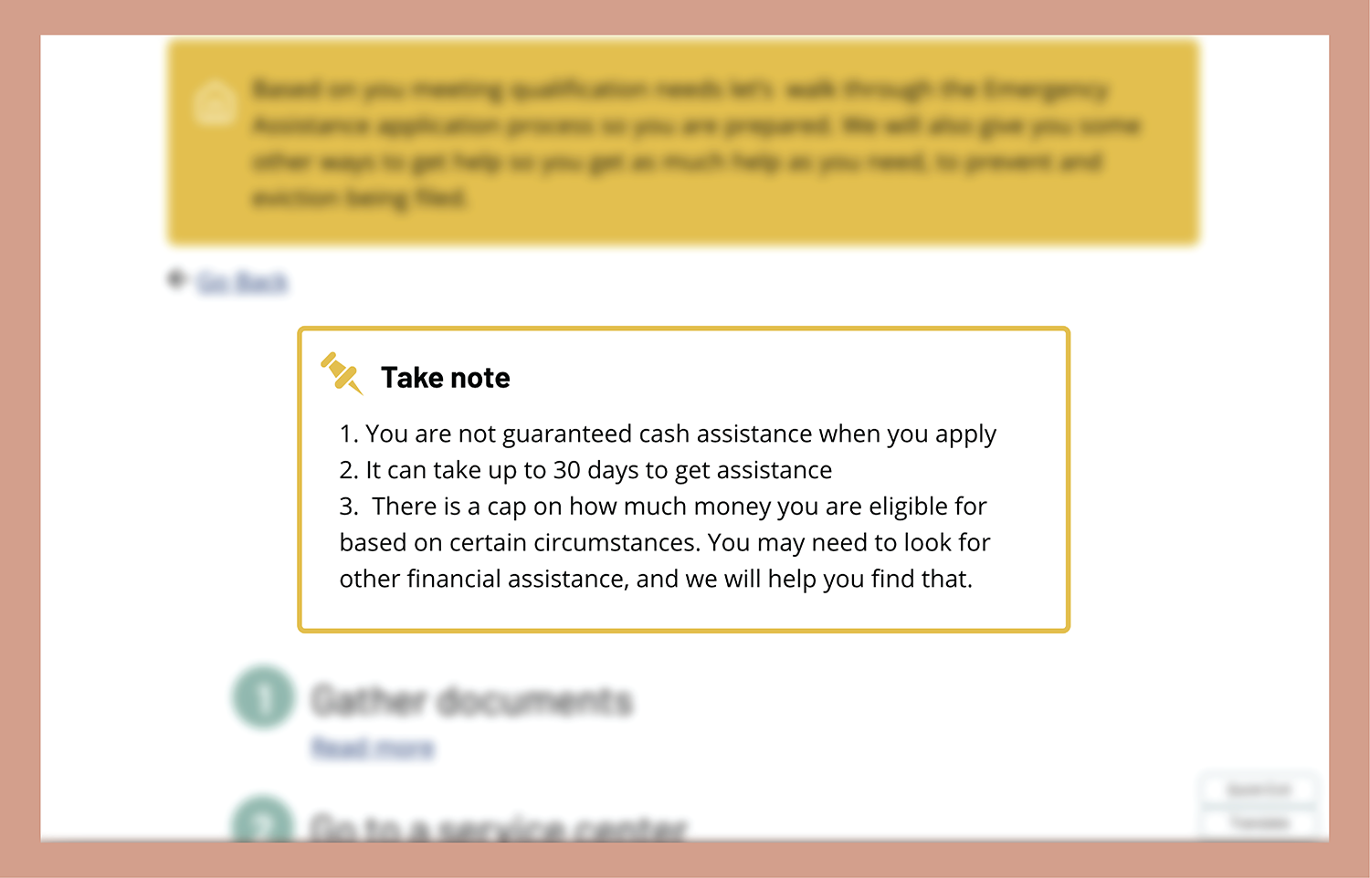
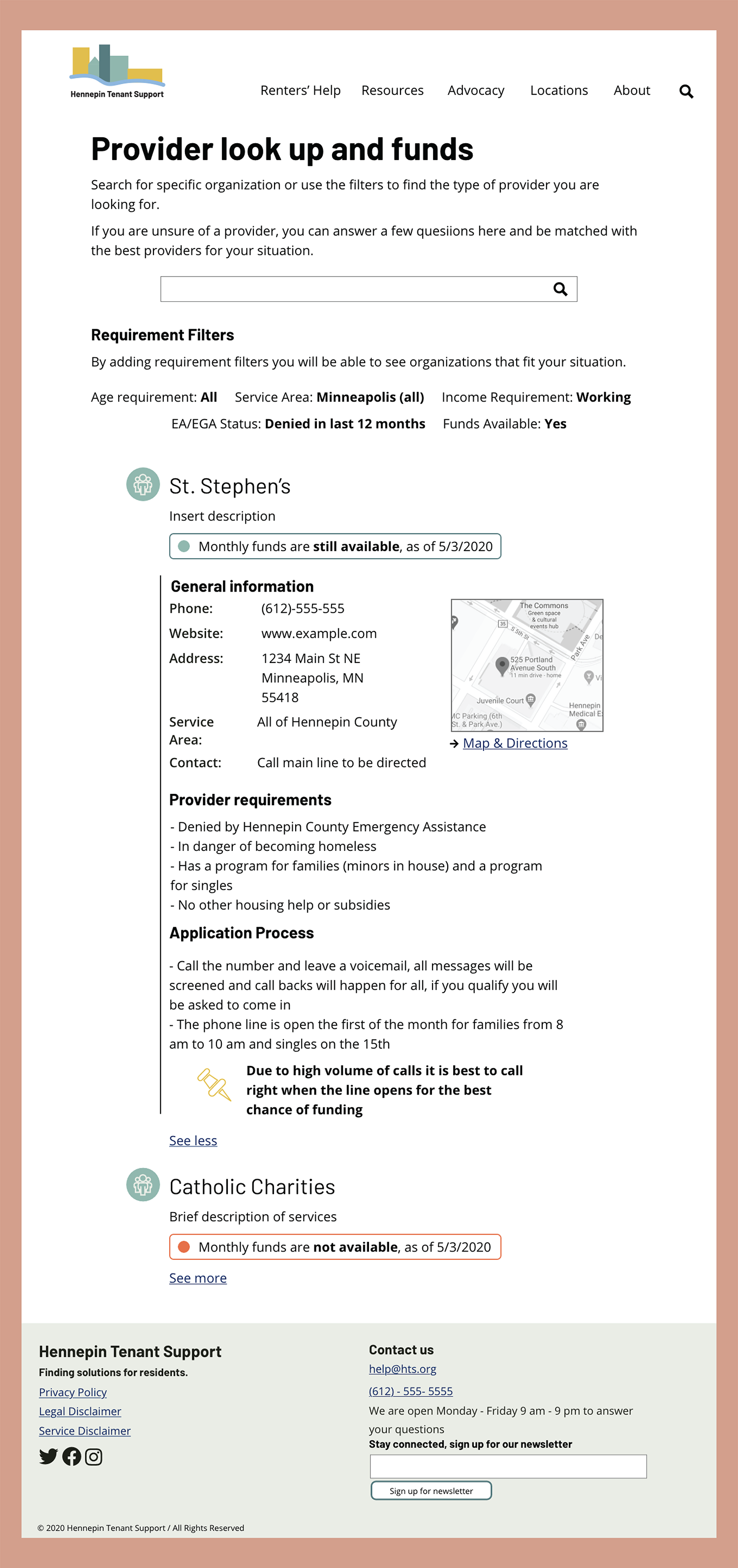
The homeless prevention system has a few situations that if a user missed important information, they are at risk of having their situation not resolved. This type of information could range from financial caps on assistance, the time it takes to get funding, or specific days they can get help.
These elements are placed when this information is critical to the user so that they get the information they need. The take note component is a stand alone element, or can also be a thumbtack image and bold text within other elements when needed.
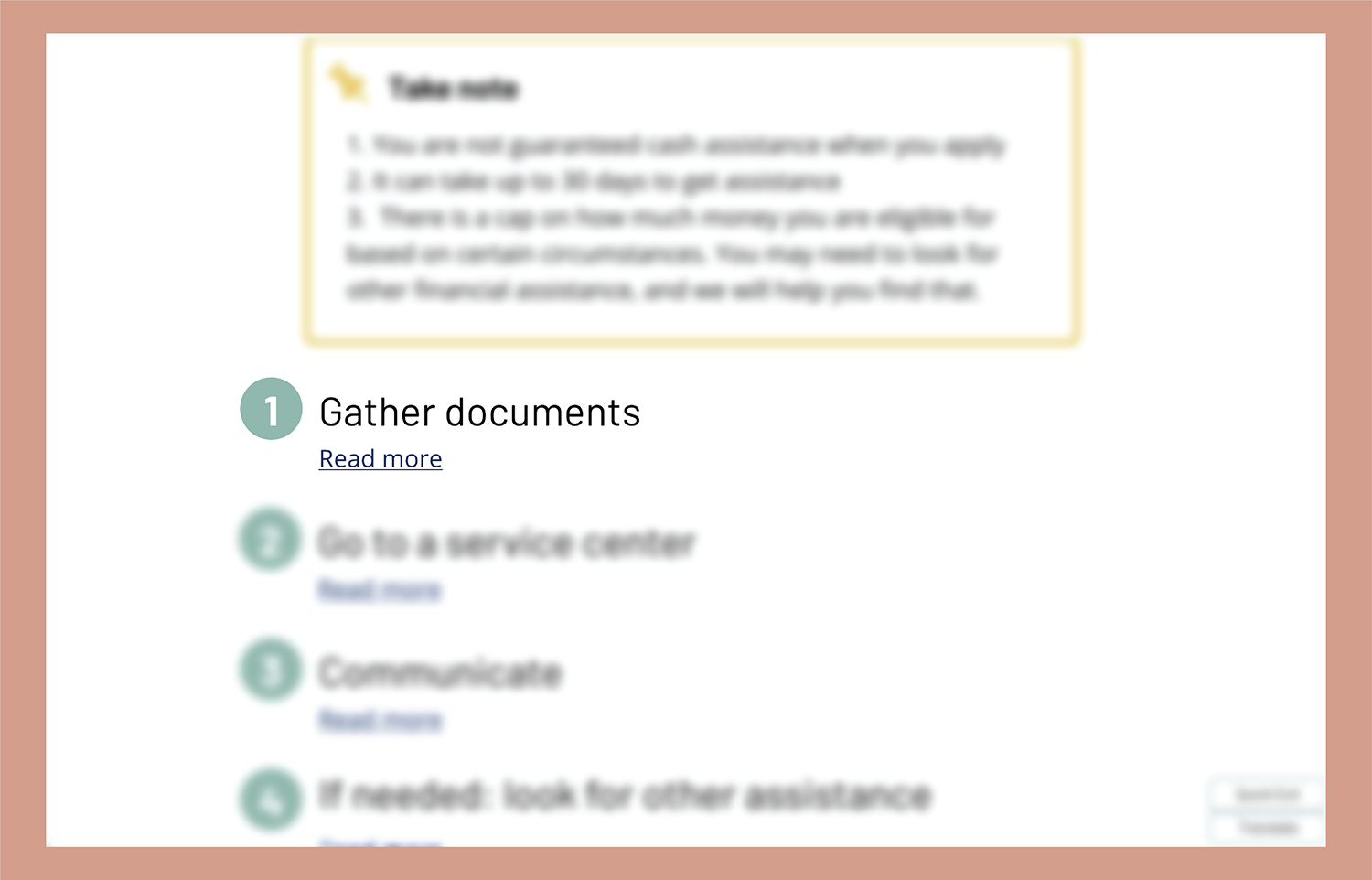
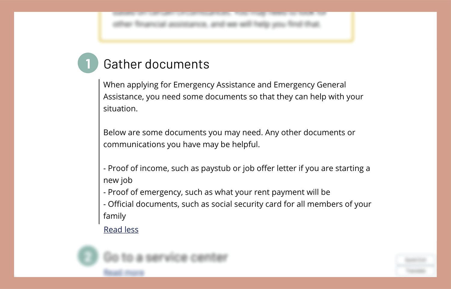
The result pages of this tool are vital; they need to be clear, yet provide as much detail and clarification as possible. Result pages have these steps ordered in chronological order of what they need to do, giving them an initial overview. From there, selecting “Read more,” expands the step, providing details to help them more easily complete the step.
During the design process, there was no ultimate owner. Discussions began on identifying owners of this product to best support Hennepin County residents. As designed, this website is for a collaborative group of community providers and government programs to manage. Other designs were created for various ownership scenarios. As of June 2020, no owner has taken on this project, with COVID-19 pushing resources online, the hope is for this product to take hold, and influence other aspects of virtual human services.
If interested, the final academic report and style guide that was written for this website is available by contacting me at camille.marrinan@gmail.com. The report outlines research findings, processes, and design in a detailed report style.
This project was made possible from funding from the McKnight Foundation to the Minnesota Design Center at the University of Minnesota College of Design, to use design thinking to help influence change in housing and government.